Why These 10 Non-Profits Billings Websites Work
Let’s face it: Websites for non-profits get a bad rap. At their best, however, they can be functional and look great! Let’s take a second to learn from the best of these in Billings.
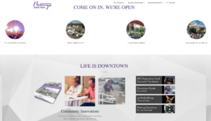
Downtown Billings Alliance
The DBA website is fun and interactive, while also being very easy to navigate. It gives compelling statistics on its homepage and affectively accomplishes its goal of educating its recipients about Downtown Billings and advertising its great potential.
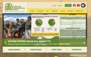
Montana Conservation Corps.
This site has a rustic design with a lot of elements, yet still is easy to read and understand. This, in addition to the number of up-to-date, informative pages, makes the MCC site one of the best non-profits sites around.
Alternatives Inc.
Alternatives is a clean, simple site dedicated to finding the right people to work with their clients and educating its visitors on their mission. The goal of Alternatives is clear from the first glance of their site and is very easy to understand and navigate.
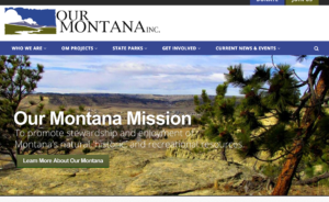
Our Montana Inc.
Our Montana Inc. is dedicated to educating Montanans about the natural and historical wonders of their state. It’s fresh design, enhanced with a stark color scheme, includes breathe-taking images of Montana, and informs in a clear, concise manner.
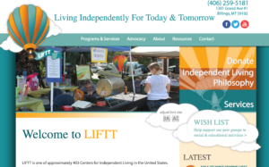
Living Independently for Today and Tomorrow
The site for LIFTT is professional and charming at the same time. They present their mission prominently and include fun graphics, including an interactive element to adjust font size easily. Cleverly included are links to all social media and the latest news.
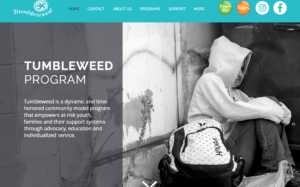
Tumbleweed Inc.
Tumbleweed’s landing page pulls at the heartstrings of its visitors while educating them of their common objective. It is colorful and clean, while making finding information quick and easy.
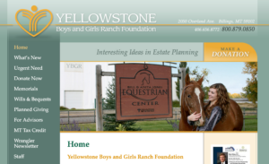
Yellowstone Boys and Girls Ranch
This site’s simple design allows for the quick navigation and is very informative. The homepage is full of helpful links, and visitors will find what they are looking for quickly and learn a lot about the Yellowstone Foundation along the way.
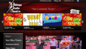
Billings Studio Theater
The site BST operates is built to be very show-biz oriented. It includes links to upcoming plays and info on how to get involved. All links are easy to find well organized, and the menu buttons have a cute hover graphic!
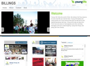
Young Life
Young Life’s page is to-the-point, colorful, and extremely functional. All photos are well- curated to support their cause, and good quality. The most impressive element, is the accessible current events, showing all of the most recent posts from 3 different social media sites.
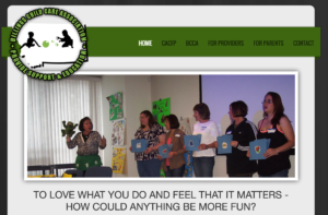
Billings Child Care Association
Lasly, the BCCA has what is probably the simplest site on the list. It gets the point across and provides accurate, up-to-date, info for it’s visitors, who will no doubt find exactly what they were searching for.
There is a common theme with these examples, and that is that all were clean, concise, and informative. Not so much that they are complicated, rather, visitors to these sites won’t spend an inordinate amount of time searching for answers because all pages are navigable. All this was accomplished while have a fun and alluring design! Do you have a non-profit site that could use a tune-up? Fill out the contact form!

