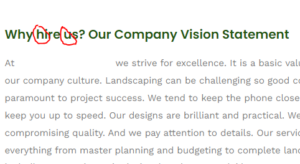
 Text formatting issues are something that really bothers me on websites. The consistency with text is very important for getting the message across in a way that is professional and not sloppy.
When I see text that doesn’t match up in the formatting, it psychologically causes an issue of judgment towards the business. This is not something that we conscientiously do, it is more subconscious.
What type of text formatting issues am I referring to?
Specifically when people use all caps or camel case and then mix it with lower case. This is a particular issue because people who are reading the website will notice as it will stick out like a sore thumb.
I don’t think people are always aware that they’re doing this and it is some thing that many overlook. For me a finished website has every last little detail completed and no errors are persisting.
So when you’re using camel case, which camel case is basically capitalizing the first letter on every word on the sentence, make sure that you’re doing that for every single item on a list, for example.
If one item has camel case and then the rest do not, it will look very unprofessional and stand out to the reader. If one title on the page is camel case, make sure all the titles are the same OR change them so that they are not.
Another place that I find inconsistencies are in menus. Sometimes people will have a menu item that is in all caps while all the other ones are just the first letter caps and that really drives me crazy.
Make sure that if you’re going to use all caps that every single menu item is all caps, or if you’re going to use just the first letter capitalization make sure that the first letter is actually capitalized and is not all lowercase on the others.
This is why text formatting is so important!
It really does drive home professionalism and will stand out as an issue to people psychologically as they are trying to evaluate your business to see if they want to do business with you.
I recommend making sure that every single last element is perfected on your website and this will require multiple different eyes on it. Even as a web developer I will make mistakes, we are all humans and sometimes we overlook things then when we think that it’s all perfect when it really there is a mistake.
That’s why it requires multiple different editors. Every single book that has been written has required multiple editors to make sure it is perfect and even then there are mistakes that get through the final print.
So this is a good analogy to websites, as we know that there can be mistakes that are on websites and when you see them it’s important to pointing them out and so that the website owner can go about fixing them.
Do you have a question about how to make sure that your website is perfect? Would you like another set of eyes to check out the website make sure that all the text formatting is done correctly? I’d be glad to assist! Fill out the contact form on my website and I will get back to you as soon as possible (:
Read next: Why One Keyword is Best


Leave a Reply
Want to join the discussion?Feel free to contribute!