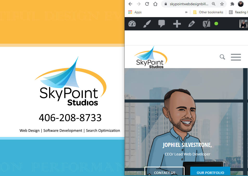
A website mobile version is very important website element to have these days. More people are using their mobile devices than desktops to browse the Internet, and therefore websites need to adapt properly.
How does a designer check to see how a website responds on different mobile devices from their desktop?
There’s actually a really cool way to do it! Website mobile version has to do with the width of the browser screen. Mobile design uses CSS to change the style of the website based on the width of the viewing screen.
So to trigger the mobile version of a website, what we need to do is reduce the screen width . Reducing the screen width is rather easy to do, first we’re going to locate the square icon in the upper right hand corner of the browser that allows us to reduce the size of the browser.
![]() It’s right next to the close X on the far right of the upper corner of the browser window. It should be right in the middle between the line for full reduction and the close X.
It’s right next to the close X on the far right of the upper corner of the browser window. It should be right in the middle between the line for full reduction and the close X.
Once we have reduced the screen size, the next thing we want to do is grab the side of the browser window with our mouse. The mouse icon will turn into a pair of arrows facing in either direction.
Once you have this selected you can move the browser window in an out, larger or smaller. What we wanna do is reduce the size of the width to the smallest size possible.
Once the browser window is very narrow, as far as it will go, this shows you what the website will look like on mobile devices. We can now navigate up and down the browser window to see how every element adapts for the smallest screen possible.

This can be very helpful for web developers. It works great for developers when working on their desktop to make sure that every element is thought out for mobile devices as well as for desktop versions, without having to load the app on their phone.
Note that it is also important to check the website on a mobile device as well to see that everything looks good because sometimes there can be a few little quirks that occur on mobile devices that you won’t see on browsers desktop browsers.
Have a question about how to get your website mobile version working properly? We are experts at that! Drop me a line on our contact form, I’ll be glad to help you out (:


Leave a Reply
Want to join the discussion?Feel free to contribute!